Font style
Kerrang Magazine

Classic Rock Magazine

I have learnt from my research that Rock magazines contain a variety of fonts (Mostly on the front covers) Fonts on front covers are normally more fancy and are big due to the fact the cover is supposed to catch the audiences eye. The fonts on the cover also resemble rock, some have smashed mastheads like the Kerrang masthead or gothic fonts in order to show iconography in the magazine. Fonts on the front covers are normally white, red or black as they are the iconic colours to see on a rock magazine. Normally the masthead or main headline is in the fanciest font because they are what represents the magazine and the content inside.
I have also learnt from my research that fonts are used in contents pages in order to structure the page and make it easier to reader. For example, in Kerrang magazine, the font in the editors message is different to the main contents font to show that it is not part of what is inside the magazine. Some fonts on the contents represents Rock music but there aren't as many as there are on the cover. Again the font colour tends to be the iconic colours, white black and red. However, Kerrang magazine break the convention by having the colour scheme black, white and yellow.
I have learnt that there are the least amount of fonts used on the double page spreads as they are only really used to structure the article and make certain parts of text stand out, for example, in Kerrang magazine, the pull quote has a bigger and brighter text than the main article text. The conventional colours can be used on a double page spread but magazines tend to go off the convention this far into the magazine. For example, Classic Rock magazine have started to use the colour yellow instead of sticking to red, black and white. Kerrang has also gone onto use pink.


These fonts are appropriate for the Rock genre as they are very gothic which can be associated with rock music seen as the lyrics in many rock songs are about chaos, the devil and dark ideology. The fonts are also appropriate because many look like they have been damaged, this relates to the rock genre as rock music is considered lowed and violent, hence the smashed Kerrang logo / masthead.
Images

The rock band on the Metallica poster wear the iconic costume of sleeveless t-shirts, skinny ripped jeans or skinny leather trousers. Most of their clothing tends to be the colour black and jewelry like necklaces and earrings are also being worn.
The props used on this poster are the drums, bass guitar and the electric guitar. The electric guitar is the main feature as it is iconic for the creation of rock music. Drums are always placed at the back like they are on the Metallica Poster as they are the least noticed in the song, along with the bass guitar..
The lighting used on this rock poster is below the rockstars, which makes them look big, powerful and almost god like as the background is in darkness and the only thing lit up is them. This also makes their shadow appear bigger implying power and dominance.
The artists are posing a for the image by taking a wide stance with their mouths open in order to imply that they are shouting. This makes them look rather scary and powerful making the poster quite effective as it lets the audience see the power Metallica posses, encouraging the audience to look up to them s role-models.
I like this image as it has a filter which shows little colour, this is iconic for the rock genre as the iconic colours include black and white. I also like the transparency of the logo and the position of it as it sends the message that these powerful, god like individuals are Metallica.
 On this AC/DC poster, the saturation of the photo is very high, resulting in only thick, block colours being seen. This makes Angus (model) appear more black which makes the poster follow the iconic rock colours of red, black and white.
Just like the Metallica poster, the lighting originally appears to be coming from a low angle, making Angus look power full and perhaps a little crazy as only his face is shown in detail.
Angus is wearing a school uniform which consists of the conventional rock colours: His tie is black and red, his shirt is white but the saturation makes it look cream (which goes better with the colour scheme of the poster) and his blazer is black along with his cap.
The accessory is Angus' cap which is iconic for the band AC/DC, this cap also follows the conventional rock colour scheme.
Angus is posing with his head raised and looking down at the camera, making him look powerful and perhaps a little crazy just like the Metallic band members who look like they are shouting. By looking crazy, the artists are representing the ideology of rock because the idea of killing and chaos is a very crazy idea.
I like the style of the image and how the saturation makes Angus look like powerful icon. I also like the conventional colour scheme that has been used.

On this album cover, the artists have a filter over them making the image look like an old photo. The main singer has also been edited with horns and a tail to resemble a devil, which is associated with Rock. All of the artists are looking at the camera and have quite a serious look, the main singing is also snarling which implies the rock genres violent culture. The artists are wearing casual clothing like jeans and black and white t-shirts. However, the main singer isn't dresses in conventional rock costume, but in what seems to be a school uniform. This is because AC/DC is iconic for wearing school clothing as it resembles "old school rock" (classic rock) The background is fiery, implying hell, which is mentioned many times in AC/DC songs.
 Many rock bands like Iron Maiden have art for their album cover. This lets the artists really show what rock ideology is about, without limiting it through a photograph of the band. Many of the album art contains violence, the devil and scary mascots of the bands.
This inspires me to take quite a serious photo on my photo shoot, with the model doing perhaps a snarl or something violent as this will portray the rock genre. The model will also be wearing conventional rock clothing that represents a certain rock sub-genre. There will also be a dark or fiery background to resemble rocks dark ideology or the devil. I feel that an illustrative image wouldn't suit a magazine cover, however I am considering including a reference to violence in my cover as this resembles rock culture.
I would also like to to include the "Legends of Rock" theme as that will interest readers because it is a very controversial topic to pick out the biggest Legend of Rock. This will intrigue readers to buy the magazine and find out who is the true Legend of Rock and if they agree or disagree.
A Halloween theme could be quite good because Halloween's scary iconography ties in nicely with the rock genre. This could encourage people who love Halloween to buy it because they might want to find out about some spooky songs that are associated with their favourite time of the year.
 On this AC/DC poster, the saturation of the photo is very high, resulting in only thick, block colours being seen. This makes Angus (model) appear more black which makes the poster follow the iconic rock colours of red, black and white.
Just like the Metallica poster, the lighting originally appears to be coming from a low angle, making Angus look power full and perhaps a little crazy as only his face is shown in detail.
Angus is wearing a school uniform which consists of the conventional rock colours: His tie is black and red, his shirt is white but the saturation makes it look cream (which goes better with the colour scheme of the poster) and his blazer is black along with his cap.
The accessory is Angus' cap which is iconic for the band AC/DC, this cap also follows the conventional rock colour scheme.
Angus is posing with his head raised and looking down at the camera, making him look powerful and perhaps a little crazy just like the Metallic band members who look like they are shouting. By looking crazy, the artists are representing the ideology of rock because the idea of killing and chaos is a very crazy idea.
I like the style of the image and how the saturation makes Angus look like powerful icon. I also like the conventional colour scheme that has been used.
Album Work

On this album cover, the artists have a filter over them making the image look like an old photo. The main singer has also been edited with horns and a tail to resemble a devil, which is associated with Rock. All of the artists are looking at the camera and have quite a serious look, the main singing is also snarling which implies the rock genres violent culture. The artists are wearing casual clothing like jeans and black and white t-shirts. However, the main singer isn't dresses in conventional rock costume, but in what seems to be a school uniform. This is because AC/DC is iconic for wearing school clothing as it resembles "old school rock" (classic rock) The background is fiery, implying hell, which is mentioned many times in AC/DC songs.
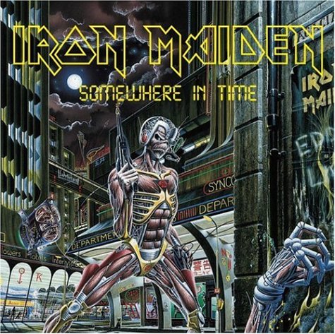 Many rock bands like Iron Maiden have art for their album cover. This lets the artists really show what rock ideology is about, without limiting it through a photograph of the band. Many of the album art contains violence, the devil and scary mascots of the bands.
This inspires me to take quite a serious photo on my photo shoot, with the model doing perhaps a snarl or something violent as this will portray the rock genre. The model will also be wearing conventional rock clothing that represents a certain rock sub-genre. There will also be a dark or fiery background to resemble rocks dark ideology or the devil. I feel that an illustrative image wouldn't suit a magazine cover, however I am considering including a reference to violence in my cover as this resembles rock culture.
Themes
Themes I would like to include to create a sell point for my product is "Bringing back the 80's" as many classic metal bands are from the 1980's and are still loved today, and some still play live also. This will bring in attention from audiences of all ages who like the rock genre because these 80's bands that are still going are loved by all ages, not just older people or younger people.I would also like to to include the "Legends of Rock" theme as that will interest readers because it is a very controversial topic to pick out the biggest Legend of Rock. This will intrigue readers to buy the magazine and find out who is the true Legend of Rock and if they agree or disagree.
A Halloween theme could be quite good because Halloween's scary iconography ties in nicely with the rock genre. This could encourage people who love Halloween to buy it because they might want to find out about some spooky songs that are associated with their favourite time of the year.

No comments:
Post a Comment