
Monday, 21 December 2015

Friday, 4 December 2015
Google Mock-up idea

I started to lasso the band from the original image and put it on my A4 document.

I then added a background and lightened the band members so they fit the setting of the background and they appear to be in the picture.

I then chose a font i thought looks best and wrote my title. I decided to put the masthead in the conventional Rock colours in order to follow the iconic rock magazine.

I added smash effects in order to show that this is a rock music magazine (Rock music is iconic for being loud and violent)

I think these fonts resemble the Rock genre in the best way as they are damaged and smashed which is iconic. I added a conventional Magazine plug also.

I made the colour scheme black, white and red in order to follow the Rock genre convention. I also added a few more images and captions in order to make the cover appear more busy.
The Contents Page

I based this contents page from the Kerrang style contents page, the colour scheme follows the conventional rock colours, the fonts also follow the conventional rock genre. I also added an editors page as this is common in most magazine contents.

I have also based this double page spread on a Kerrang magazine double page spread. I have stuck to the iconic rock colours to keep to the conventions of the genre,
Friday, 20 November 2015
Costume Design / names / colour schemes / feature stories / mise-en-scene

I have picked the model to have long dark hair because this is iconic for rockers.
I have chosen a leather jacket because all the way back to the 1980's, rockers have been wearing leather so I would like to stick to tradition.
I have chosen black skinny jeans because this is what is commonly worn in the modern times of rockstars.
I have picked black boots for the model to wear as boots are considered very masculine which is what the rock genre is about.
All rockers have jewelry so i have decided to include it also.
The colour scheme is black as that is the conventional colour scheme for a metal rock band.
I have chosen this outfit as it fits into the rock genre convention and is an iconic look for rock-stars. It will appeal to the rock audience as this costume is worn by all the old, classic bands who are very popular, even now. This costume is easily recognized and still worn by the rock fan base today.

A have chosen a shirt because shirts are very fashionable in today's world and the fact it is black also fits in with the rock theme.
I have picked skinny jeans because they are the most common item of clothing rock-stars wear, and they are very popular in the general public.
Converse are very fashionable in the present day and are very popular and appealing to the rock audience, that is why I have picked them.
Really long hair is a bit old fashioned, a much more modern look is shortish black hair that is messy as it has a very punk vibe. This hair style is also more commonly seen than long hair.
Eyeliner is commonly worn among all rock artists, therefore to go with this modern look, eye liner is needed.

This look is a more free, hippie look to rock, it supports the classic rock sub-genre but is also quite modern.
The ripped skinny jeans imply the violent ideology rock contains, however the jeans bring a quite modern look to rock as they are worn a lot by the public today. The jeans are also black to resemble rock.
The head band brings the indie, hippie look to the costume, as if the artists is going to perform at a festival. The headband is commonly red, as red is one of rocks iconic colours.
The artists longish hair is also a modern, more fashionable look than the stereotypical long hair. However, the messiness represents the violent ideology of rock. This hairstyle is also very common now in the rock industry.
The sleeveless top is is a very traditional, stereotypical piece of clothing that rock-stars have worn over the years. They are also very common in today's rock industry.
The bracelets represent the hippie look to the outfit and also bring the festival vibe.
The army boots are a very indie rock look, indie rock is very popular today, showing that this rock outfit is more modernized and appealing to the youth of rock.
Female rockers tend to mix their outfit between these 3 costumes. For example, a female rocker would tend to have long black hair, a black shirt or leather jacket, she would have skinny jeans with army boots or converse, and plenty of bracelets.
Mise-en-scene
 I would like to have my photo-shoot at a concert, I have got this inspiration from the double page spreads in Kerrang Magazine. Many fans of rock love to see their favourite singer or guitarist live, by taking a picture of them live, it makes them feel like they are there and makes them experience some of what the people did on the night. However, I know that I cannot have my photo-shoot at a live concert so I am going to photo-shop a stage into the shot to try and get the same effect.
I would like to do a photo-shoot in a Green Screen room as many magazine covers like Rock sound and Kerrang have a green screened background with dark colours photo-shopped behind the model. By adding a background, it lets me express rock ideology by showing a gradient of the conventional rock colours, this will imply to the audience that this is a rock magazine.

 I would also like my photo-shoot to take place in a ran down area, with the stereotypical graffiti, as this will represent rocks violent ideology as many buildings in ran down areas are damaged. I have no inspiration for this idea.
 The props I would use in my photo-shoot would be an electric guitar and maybe other musical props like a microphone or a set of drum sticks. This will show that the magazine is a rock magazine due to the certain instruments that are being used. I got this inspiration from Kerrang Magazines front cover.
 I am also thinking to use props with meaning, for example my model could be holding a megaphone to represent rocks iconography for being loud. I could also get the model to hold a baseball bat in order to imply rock's violent ideology of chaos. I got this inspiration from Rock Sound magazine.
Name Choices / Ideas
Kerplunk - I have come up with this name as it sounds like the popular Rock magazine Kerrang. I like it as it sounds like a violent sound effect therefore representing Rock ideology.E-Rock - I have come up with this name as it stands for Every Rock, as this magazine will cover every style of rock.
Smash - This also sounds like a violent sound effect which therefore represents Rock ideology.
Distortion / Distort - I came up with this name as on many Rock tracks, the distortion on a guitar is turned up to full, giving the rock effect.
Cock! - This stands for Classic Rock, the word cock which is a swear represents the rock genres rebellion to society and the idea of what we should and shouldn't say.
Rock Now - Represents the rock in modern society and the latest news on the genre and bands in it.
Cracked - Glass cracks when loud music like rock is played.
Def - Rock has been described as deafening as it is really loud.
Solo - A solo is an iconic part of a rock song.
Encore - It is what a crowd chant if they want the band to come on again.
Un-Plugged - This resembles the pluging in and out of the guitar lead.
Banned - Rock is rather explicit music, therefore Banned would be a good name.
Colour Schemes
Colour Scheme 1

I have picked this colour scheme as it includes the conventional rock genre colours; red, black and a light colour which is almost white. I have chosen this light pink colour instead of white as I feel it complements the blue and red more. The grey complements the black as they are both dark colours and resemble the rock genre. The blue is a split - complementary colour to the red, implying that it will go well with the rest of the colours.
Colour scheme 2

This colour scheme is very dark and therefore will resemble the rock magazine well as the dark colours will represent the dark ideology of the genre.
Colour scheme 3

This colour scheme represents the traditional rock colours. I think it's best just to stick to the three iconic colours as i feel that my magazine will be going off topic and convention if I used any other colour.
Colour scheme 4

This colour scheme represents the modern side of rock, punk rock. This is shown by the colours being lighter than the classic rock colours, making it look more youthful and modern.
Feature Stories
- Q and A with an artist of the genre.
- Who is the greatest Rock Legend of all time
- The Rockstar Lifestyle
- About a band on tour.
- New album release
- Interview with an artist
- Best of the 80's
- Return of an artist
- Artist album band, classed as "Satanist"
- AC/DC Drummer jailed after planning a murder
Friday, 13 November 2015
Demographic Table
A Demographic Table is the measurable characteristics of media consumers such as age gender race education income. Here is a table of all the different categories of social class:


 The model on the cover is of an elderly gentleman implying the magazine is aimed for the higher class audience as older people tend to be wealthier than younger generations. The fact that the model is also wearing a suit implies that the magazine is aimed for high class audiences as only wealthy people walk round in a suit, other classes wear casual clothing.
The font of the masthead looks very sophisticated implying that the magazine is aiming for higher, more sophisticated audiences.
The adverts included in Classical Music magazine are things like expensive watches, which implies that the magazine is aiming at the higher class as only high class people will want to pay for an extremely expensive watch.

 Rock Sound magazine is a free magazine which implies it is aiming for the working class audience. (Categories D and E)


 Kerrang Magazine
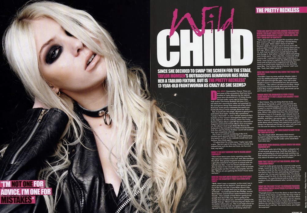
The Kerrang Magazine is stapled together and is made of thin paper, this implies that it is suited for lower class groups of society.
It has a price of £3.00 which is quite pricey for a paperback magazine, implying that it is aiming for a low class but not as low as class E or perhaps D.
The gifts inside are posters which are not really appealing to a high class group of people, which implies that the magazine is aiming for lower class appeal.
The type of language the Magazine uses implies it is suited for the lower class as the upper class audience would be shocked if they saw the word "Sex" and "Satan" on the front of the magazine.
The articles inside do not include much writing. However an image takes up half of the two pages, this implies that the magazine is aimed at the lower class as lower class people tend to be not as educated as higher class people and do not enjoy a lot of reading.
The models on both the cover and article are wearing casual clothing and are quite young which is commonly associated with lower class people because young people tend to not have as much money as older generations.
The adverts included in the magazine tend to be about booking concert tickets and festivals which are more appealing to lower class groups as higher classes would have already booked tickets if they wanted to go.
Classical Magazine
The Classical Music magazine is made of glossy paper with a spine, this implies that the magazine is for the high class groups because it is of a high quality which will imply its more expensive also.
£4.25 which is considered expensive for a magazine implying that it is aiming for the high class audience as a lower class person would not be able to afford or might not want to pay that much money monthly for a magazine.
The model on the cover is of an elderly gentleman implying the magazine is aimed for the higher class audience as older people tend to be wealthier than younger generations. The fact that the model is also wearing a suit implies that the magazine is aimed for high class audiences as only wealthy people walk round in a suit, other classes wear casual clothing.The font of the masthead looks very sophisticated implying that the magazine is aiming for higher, more sophisticated audiences.
The adverts included in Classical Music magazine are things like expensive watches, which implies that the magazine is aiming at the higher class as only high class people will want to pay for an extremely expensive watch.
The articles in Classical Music magazine don't include many pictures but do include a lot of text implying that Classical Music magazine is aiming for audiences of a high social class because they like to read a lot more compared to lower classes.

Rock Sound magazine
 Rock Sound magazine is a free magazine which implies it is aiming for the working class audience. (Categories D and E)
The magazine is also giving away free gifts (CD +Posters) which also implies that it is aiming for a very low class audience as they are giving them gifts without making them pay anything.
The models on the cover imply that magazine is aiming for a lower class audience as they are wearing casual clothing.
Rock Sound magazine include words like "F****" on their cover which implies it is for lower classes because higher class people would be horrified to see that on a magazine.
The headlines don't seem as informative as the headlines on Classical Magazine, showing the difference between a high class magazine and a working class magazine.
The articles in Rock Sound magazine don't include a lot of text, which implies that it is aiming for low class audiences who don't like to read or who struggle to. To support this, 3/4 of the double page spread is covered with images.
The magazines paper is also quite cheap, it is also stapled together implying that it is not of high quality and is suited to lower classes.

My Magazine
The social class I will be aiming my magazine at is the lower middle class (Group C1) as i believe that most rock magazines fit between the working class and middle class. I also think that a high class rock magazine would not work because rock is not a high class genre, it is listened to by mostly working and middle class people.
To adhere my audiences needs, I will also include interesting articles on bands and the music industry and what controversial topics there are in it at the moment. I will include album reviews in order to advise my reader whether to buy it or not, this will be done with a simple 5 star rating as it is easy to understand for lower class audiences who perhaps don't want to read a lot. My magazine will consist of mostly pictures in order to appeal to lower classes. I will also include adverts for cheap products in order to appeal to the social class I am aiming for.
The price of the magazine will be £2.50 so it targets classes C - B. Most rock magazines are also priced around this range.
I will include free gifts like Posters and Cd's about rock bands both old and new as these are cheap products that the lower class are interested in. I will also include prizes for concert tickets in order to give the lower class a chance to see their favourite band.
The social class table helps me with my feature stories because I know that if i'm aiming at lower classes, I will need to include more pictures than text and will use informal language and slang which they will recognize and appeal to. The social class table helps me develop my reader profile as I can now see what type of groups enjoy rock magazines like Kerrang.
Style / Iconography
Font style
Kerrang Magazine

Classic Rock Magazine

I have learnt from my research that Rock magazines contain a variety of fonts (Mostly on the front covers) Fonts on front covers are normally more fancy and are big due to the fact the cover is supposed to catch the audiences eye. The fonts on the cover also resemble rock, some have smashed mastheads like the Kerrang masthead or gothic fonts in order to show iconography in the magazine. Fonts on the front covers are normally white, red or black as they are the iconic colours to see on a rock magazine. Normally the masthead or main headline is in the fanciest font because they are what represents the magazine and the content inside.
I have also learnt from my research that fonts are used in contents pages in order to structure the page and make it easier to reader. For example, in Kerrang magazine, the font in the editors message is different to the main contents font to show that it is not part of what is inside the magazine. Some fonts on the contents represents Rock music but there aren't as many as there are on the cover. Again the font colour tends to be the iconic colours, white black and red. However, Kerrang magazine break the convention by having the colour scheme black, white and yellow.
I have learnt that there are the least amount of fonts used on the double page spreads as they are only really used to structure the article and make certain parts of text stand out, for example, in Kerrang magazine, the pull quote has a bigger and brighter text than the main article text. The conventional colours can be used on a double page spread but magazines tend to go off the convention this far into the magazine. For example, Classic Rock magazine have started to use the colour yellow instead of sticking to red, black and white. Kerrang has also gone onto use pink.


These fonts are appropriate for the Rock genre as they are very gothic which can be associated with rock music seen as the lyrics in many rock songs are about chaos, the devil and dark ideology. The fonts are also appropriate because many look like they have been damaged, this relates to the rock genre as rock music is considered lowed and violent, hence the smashed Kerrang logo / masthead.
Images

The rock band on the Metallica poster wear the iconic costume of sleeveless t-shirts, skinny ripped jeans or skinny leather trousers. Most of their clothing tends to be the colour black and jewelry like necklaces and earrings are also being worn.
The props used on this poster are the drums, bass guitar and the electric guitar. The electric guitar is the main feature as it is iconic for the creation of rock music. Drums are always placed at the back like they are on the Metallica Poster as they are the least noticed in the song, along with the bass guitar..
The lighting used on this rock poster is below the rockstars, which makes them look big, powerful and almost god like as the background is in darkness and the only thing lit up is them. This also makes their shadow appear bigger implying power and dominance.
The artists are posing a for the image by taking a wide stance with their mouths open in order to imply that they are shouting. This makes them look rather scary and powerful making the poster quite effective as it lets the audience see the power Metallica posses, encouraging the audience to look up to them s role-models.
I like this image as it has a filter which shows little colour, this is iconic for the rock genre as the iconic colours include black and white. I also like the transparency of the logo and the position of it as it sends the message that these powerful, god like individuals are Metallica.
 On this AC/DC poster, the saturation of the photo is very high, resulting in only thick, block colours being seen. This makes Angus (model) appear more black which makes the poster follow the iconic rock colours of red, black and white.
Just like the Metallica poster, the lighting originally appears to be coming from a low angle, making Angus look power full and perhaps a little crazy as only his face is shown in detail.
Angus is wearing a school uniform which consists of the conventional rock colours: His tie is black and red, his shirt is white but the saturation makes it look cream (which goes better with the colour scheme of the poster) and his blazer is black along with his cap.
The accessory is Angus' cap which is iconic for the band AC/DC, this cap also follows the conventional rock colour scheme.
Angus is posing with his head raised and looking down at the camera, making him look powerful and perhaps a little crazy just like the Metallic band members who look like they are shouting. By looking crazy, the artists are representing the ideology of rock because the idea of killing and chaos is a very crazy idea.
I like the style of the image and how the saturation makes Angus look like powerful icon. I also like the conventional colour scheme that has been used.

On this album cover, the artists have a filter over them making the image look like an old photo. The main singer has also been edited with horns and a tail to resemble a devil, which is associated with Rock. All of the artists are looking at the camera and have quite a serious look, the main singing is also snarling which implies the rock genres violent culture. The artists are wearing casual clothing like jeans and black and white t-shirts. However, the main singer isn't dresses in conventional rock costume, but in what seems to be a school uniform. This is because AC/DC is iconic for wearing school clothing as it resembles "old school rock" (classic rock) The background is fiery, implying hell, which is mentioned many times in AC/DC songs.
 Many rock bands like Iron Maiden have art for their album cover. This lets the artists really show what rock ideology is about, without limiting it through a photograph of the band. Many of the album art contains violence, the devil and scary mascots of the bands.
This inspires me to take quite a serious photo on my photo shoot, with the model doing perhaps a snarl or something violent as this will portray the rock genre. The model will also be wearing conventional rock clothing that represents a certain rock sub-genre. There will also be a dark or fiery background to resemble rocks dark ideology or the devil. I feel that an illustrative image wouldn't suit a magazine cover, however I am considering including a reference to violence in my cover as this resembles rock culture.
I would also like to to include the "Legends of Rock" theme as that will interest readers because it is a very controversial topic to pick out the biggest Legend of Rock. This will intrigue readers to buy the magazine and find out who is the true Legend of Rock and if they agree or disagree.
A Halloween theme could be quite good because Halloween's scary iconography ties in nicely with the rock genre. This could encourage people who love Halloween to buy it because they might want to find out about some spooky songs that are associated with their favourite time of the year.
 On this AC/DC poster, the saturation of the photo is very high, resulting in only thick, block colours being seen. This makes Angus (model) appear more black which makes the poster follow the iconic rock colours of red, black and white.
Just like the Metallica poster, the lighting originally appears to be coming from a low angle, making Angus look power full and perhaps a little crazy as only his face is shown in detail.
Angus is wearing a school uniform which consists of the conventional rock colours: His tie is black and red, his shirt is white but the saturation makes it look cream (which goes better with the colour scheme of the poster) and his blazer is black along with his cap.
The accessory is Angus' cap which is iconic for the band AC/DC, this cap also follows the conventional rock colour scheme.
Angus is posing with his head raised and looking down at the camera, making him look powerful and perhaps a little crazy just like the Metallic band members who look like they are shouting. By looking crazy, the artists are representing the ideology of rock because the idea of killing and chaos is a very crazy idea.
I like the style of the image and how the saturation makes Angus look like powerful icon. I also like the conventional colour scheme that has been used.
Album Work

On this album cover, the artists have a filter over them making the image look like an old photo. The main singer has also been edited with horns and a tail to resemble a devil, which is associated with Rock. All of the artists are looking at the camera and have quite a serious look, the main singing is also snarling which implies the rock genres violent culture. The artists are wearing casual clothing like jeans and black and white t-shirts. However, the main singer isn't dresses in conventional rock costume, but in what seems to be a school uniform. This is because AC/DC is iconic for wearing school clothing as it resembles "old school rock" (classic rock) The background is fiery, implying hell, which is mentioned many times in AC/DC songs.
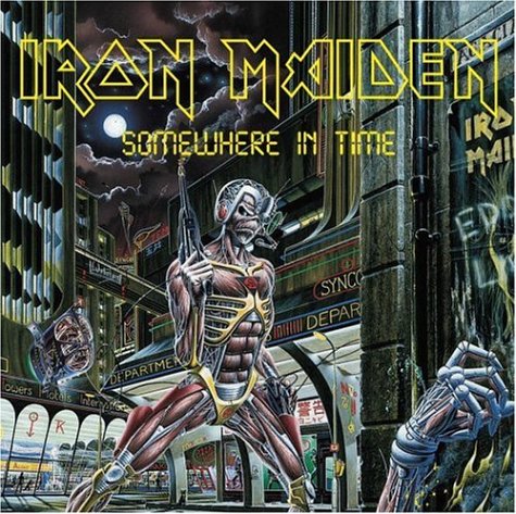 Many rock bands like Iron Maiden have art for their album cover. This lets the artists really show what rock ideology is about, without limiting it through a photograph of the band. Many of the album art contains violence, the devil and scary mascots of the bands.
This inspires me to take quite a serious photo on my photo shoot, with the model doing perhaps a snarl or something violent as this will portray the rock genre. The model will also be wearing conventional rock clothing that represents a certain rock sub-genre. There will also be a dark or fiery background to resemble rocks dark ideology or the devil. I feel that an illustrative image wouldn't suit a magazine cover, however I am considering including a reference to violence in my cover as this resembles rock culture.
Themes
Themes I would like to include to create a sell point for my product is "Bringing back the 80's" as many classic metal bands are from the 1980's and are still loved today, and some still play live also. This will bring in attention from audiences of all ages who like the rock genre because these 80's bands that are still going are loved by all ages, not just older people or younger people.I would also like to to include the "Legends of Rock" theme as that will interest readers because it is a very controversial topic to pick out the biggest Legend of Rock. This will intrigue readers to buy the magazine and find out who is the true Legend of Rock and if they agree or disagree.
A Halloween theme could be quite good because Halloween's scary iconography ties in nicely with the rock genre. This could encourage people who love Halloween to buy it because they might want to find out about some spooky songs that are associated with their favourite time of the year.
Friday, 23 October 2015

Subscribe to:
Posts (Atom)